注
末尾へ移動して完全なサンプルコードをダウンロードするか、Binder経由でブラウザでこの例を実行します。
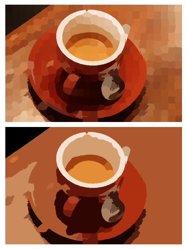
領域隣接グラフ(RAG)の閾値処理#
この例では、領域隣接グラフ(RAG)を構築し、色の類似した領域をマージします。RAGを構築し、平均色の差をエッジとして定義します。次に、平均色が類似した領域を結合します。
from skimage import data, segmentation, color
from skimage import graph
from matplotlib import pyplot as plt


img = data.coffee()

labels1 = segmentation.slic(img, compactness=30, n_segments=400, start_label=1)
out1 = color.label2rgb(labels1, img, kind='avg', bg_label=0)

g = graph.rag_mean_color(img, labels1)
labels2 = graph.cut_threshold(labels1, g, 29)
out2 = color.label2rgb(labels2, img, kind='avg', bg_label=0)

fig, ax = plt.subplots(nrows=2, sharex=True, sharey=True, figsize=(6, 8))

ax[0].imshow(out1)
ax[1].imshow(out2)

for a in ax:
    a.axis('off')

plt.tight_layout()
スクリプトの合計実行時間:(0分3.966秒)